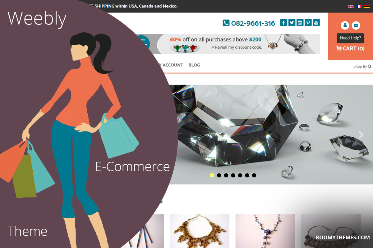
We’re delighted to inform you all that Onsale Theme has been updated to version 1.3. The latest update adds a more modern and content-driven feel to the theme. In addition to these, there’s been a number of changes to both the look and functionality of the theme.
Onsale Weebly E-Commerce Theme Updated to Version 1.3
In the course of the update, we’ve added some new features as well as eliminated some older ones. Let’s have a look at some of the changes:
HEADER
The header’s been fully redesigned to look more like an e-commerce theme and hold more features. The call-to-action and contact blocks (such as phone number, contact link and social icons) are now very hard to miss. We’ve moved the “language flags” from the bottom footer to the top header and added a section for slogan. The header also has a new feature, an ad area where you can place an advertisement banner.
The navigation menu which on previous versions was squeezed in to the right header has now been moved below the main header so that there’s enough room for your menu items.
Don’t miss: Introducing Onsale Weebly E-Commerce Template
E-COMMERCE FEATURES
We’ve redesigned e-commerce features to conform with the new look. Seeing as weebly has introduced a new products element and categories and discontinued (perhaps temporarily) the old product element, we’ve customized the new e-commerce elements to match the modern look of Onsale theme.
The cart, product pages, storefront and product category pages have all been updated.
Read also: Weebly E-Commerce, Udua Theme Updated To Version 2.0
HEADER TYPES (Page Layouts)
We’ve eliminated some header types as well as added some new ones. “Tall” and “Short” headers for example have both been eliminated and replaced by “Header” layout which now enables you to drag the header height up or down to have short or tall headers for any page. All the page layouts have been redesigned to match the new look.
FOOTER CALL-TO ACTION
You will now notice three content blocks above the footer, that’s footer call-to-action section which was not available in previous versions of the theme. The block has three columns, left, middle and right.
The left column has our “vital social”plugin, a weebly social media plugin that enables you to display posts from Facebook, Twitter and Instagram, all in one place.
The middle column has a drag and drop content section. In the theme demo, we use it to display an email signup form but you can drag and drop any weerbly element there to build it however you want.
The right column has our newly introduced “feed clipper” plugin. which can be used to show latest blog posts or news. You will be able to click to edit each block.
THEME OPTIONS
The theme options have also been updated to make customizing the theme even easier. You will be able to turn on/off any feature or content sections you don’t need. The color schemes have also been updated.
If you’re building an online store using weebly, you really need to try onsale theme. If Onsale theme is not doing it for you, here’s another weebly store template you will find perfect for any online store.
Download Onsale Theme | View Live Demo
Love the article? Don’t forget to subscribe to our mailing list and follow our social media pages to get notified of new tutorials, new weebly tools, products and tips on how to build a successful weebly website. And don’t forget to visit our blog page for more awesome weebly tutorials and tools.

